Hello, after finishing my first vector font, I have decided that it would be a good cause for a blog post. The making of Quadrata Denuo (later QD) (you can find it here) was quite an endurance challenge, indeed, because I have never done anything this meticulous. Prior to that, I have made a couple of bitmap fonts (some of them are already available on my website), but I didn’t spend nearly as much time on them, as I did on this one. I think in total I have spent about a month on QD, which is surprisingly a small amount of time for a font.
My original idea for QD was to simply replicate the Gothic calligraphy I’ve been learning to write for some time. Speaking of calligraphy, I have been practicing it on and off since the beginning of this year (approximately 1-2 times per week, sometimes completely forgetting about it for a month or two), and only at the end of this summer have I gathered enough courage to do calligraphy every single day for 30 days straight (rookie numbers, some might say). This streak is what elevated my skill just enough for me to become more confident and finally make some kind of written piece on a good 185gsm paper. After enough practice, I have written down a specimen of both uppercase and lowercase Textualis Quadrata letters (one of the scripts belonging to Gothic (aka Black letter) family), and this is where it sparked to me: “Wouldn’t it be cool to make a font out of that?” (There was also a Fraktur specimen, but I thought it was not good enough in order to trace it for a font)

After watching some of the Paul Antonio’s (a really talented calligrapher) videos on Textualis Quadrata, I have got some idea on the structure of this script. To put it simply, each lowercase letter can be divided into basic components. This knowledge must have saved me a lot of time and effort, because it meant, that all I had to do is to first make those basic components in vector, and then simply combine them and construct letters out of them based on the original drawing, instead of manually tracing or entrusting the machine to do tracing for me.

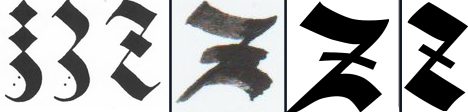
While lowercase letters were mostly really easy to make because of their
aforementioned structure, there was one exception, namely letter z. The
original z that I have drawn looked extremely alien to all the letters, it’s
as if it was taken from another font. For inspiration on that letter, I have
looked at some of the scans from Albrecht Dürer’s “Unterweisung der Messung”
book, and I found three variations of z. After a couple of iterations, I have
quickly made a new z and this time it was in harmony with every other
letter. There were some minor changes to other letters, e.g. horizontal stroke
of t is a bit elongated compared to the original drawing, but other than
that, it was really a walk in the park.
Uppercase letters is where the making of the font has slowed down to a crawl. That’s because now I couldn’t simply go ahead and construct letters out of 3 components, I had to actually do a lot of tracing by hand (I didn’t want to use auto-tracing, I wanted to have more control over all the shapes). However, that doesn’t mean that basic components were of no use anymore. The width of vertical stroke had to be the same as of the lowercase letters for the sake of consistency; and the diamond shape is used quite extensively across all the uppercase letters as decoration.
What I also noticed is that a lot of the strokes had to be just slightly
changed to look good on a screen. The most noticeable example is letter X, it
has so many strokes that go through its middle, if I left the letter as is
after tracing it, it would look off. Letters K and L appeared to be smaller
than every other letter, because of their pointy vertical stem. There is one
kind of optical illusion, where a pointy object is perceived to be smaller by
our eyes, when in fact, it is of the same height as every other letter. That is
easily fixed by just making the letter a bit taller than every other one.
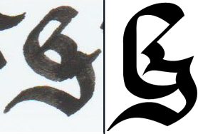
The one letter that I couldnt get right is G. I have spent so much time
tweaking every stroke of this letter to make it look good (I still think it
could have been better). The reason as to why this happened is because
admittedly, the G I have written down on the drawing was pretty bad. After
many attempts at redrawing G, I finally got the one that was worth tracing
and even then I had to change many things after I’ve traced the letters.
Obviuosly, many other letters do have their own fair share of interesting
tidbits, but it would take quite a bit of time to explain most of them, and it
would be quite difficult to describe because I didn’t record each and every
iteration of every letter unfortunately.
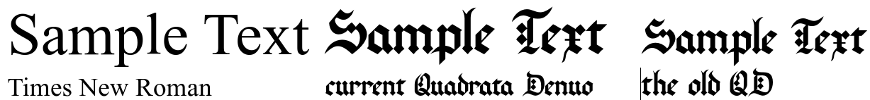
In “Designing Type” by Karen Cheng, the author mentions that a design project has to have a “brief” – a list of answers on the most basic questions a designer would ask himself when making a font: where is it gonna be used, how and what for. When I started making QD, the only thing I wanted from it is to simply replicate letters I have written on a piece of paper on a computer. Later, I have figured out that since I have used a 2.4mm PILOT Parallel Pen on the original drawing, perhaps it is best to optimize it for medium font sizes (I think 24-36pt look the best, in my opinion). (Obviously the font has many more properties than just the optimal size of it, but since I didn’t have a brief, I could do whatever I wanted with my font)
Perhaps, the original drawing I have made is not that well suited for tracing over them. A lot of the previously mentioned challenges come from the fact that they weren’t well written to begin with. But at the time when I started making a font, I thought that it would be good enough, and most importantly, I was able to fix all those issues anyway.
Making a digital font comes with its own fair share of challenges, not related to drawing letters themselves. After making vectorized characters, the next obvious step is to make a font file out of them. This is the best time to mention the software I have used to make QD. The vector drawing software that was used to draw the actual glyphs was Inkscape. For those, who don’t know, it is a very capable, free and open source vector graphics editor, that also has a built-in SVG font editor, which makes it easier to organize your glyphs (and it also allows you to change kerning and the width of glyphs, but there are better ways to do it). The font editor I was using was FontForge, which is also free and open source. (Didn’t spend a dime on software)
The most tedious thing about making a font, is, in my opinion, kerning. You
have to spend so much time fine-tuning it, because it can make or break your
font. Thankfully, FontForge allows you to reduce this tedium. Instead of
creating each and every possible letter pair, you can split letters in classes.
What I have noticed in QD, is that a lot of letters look exactly the same on
their extremities. E.g., Letters a c e g o q share the same strokes on their
left side, meanwhile letters a u share the same strokes on their right side.
I still had to go through each and every capital letter separately in order to
kern them, but even then classes still helped me immensely.

The one very peculiar problem I have noticed is that my font looked smaller than any other font. To this day, I am not actually sure if that’s a good or bad thing, but nonetheless, I’ve decided to remedy this issue (as you can notice by this wording, I am of opinion, that perhaps, it is an issue). What I went ahead and done is very simple, I have scaled up all the letters by 25% (Unfortunately FontForge didn’t scale kerning values properly, and I had to go through and adjust each and every kerning class myself, which was quite a bit boring, but thankfully, I have managed to go through them pretty fast). Was it really necessary? I don’t know. But I can imagine a situation, where you had layed out a page with some other font, and suddenly, you have got an urge to use QD, at least it wouldn’t be of a too different size compared to every other font.
FontForge can “validate” your font. It can look for issues, and can even automatically fix some of them. These problems include but not limited to: missing extremas, self-intersections, non-integral coordinates, etc. Thankfully FontForge does a good job at fixing them, and there is a lot of info on the Internet on what to do about them.
The other problem, that I haven’t yet figured out how to fix, is that Inkscape sometimes just refuses to load some of the glyphs and I don’t know why. However, I will update this blog post as soon as I will find a solution to this issue. And also, for whatever reason, WordPad renders QD without kerning. (If I will find a solution, I will update the post just as well)
It is important to mention, what sources have I used in order to make this font. I have learnt to write lowercase letters with a broad edge nib from Paul Antonio’s videos, and capital letters from the Calligrapher’s Bible (which themselves were based on Dürer’s Gothic capitals). In order to learn how to use FontForge I have used the “Designing with FontForge” guide. I have also been reading “Designing Type” by Karen Cheng, it has a lot of information on how to make a good font.
In conclusion, making my first vector font was definitely an experience. Compared to bitmap fonts I did in the past, this one is definitely a lot harder. You have to take into consideration so many more things. E.g. all of the bitmap fonts I have made are monospace, and while kerning was considered, because even in monospace font you have to make all characters look good with each other, I definitely didn’t have to set up kerning for each and every class of letters. Will this font be of any use? Perhaps, I will be able to find some usecase for it. Does this font has so many problems, that I can’t even notice due to my lack of experience? Perhaps, it does. But was it fun to make QD? Hell yes, it was. I already have a couple of ideas for new fonts and what can I add in QD (cyrillic letters perhaps???), so I don’t think I will stop making fonts any time soon, and if I will, well, perhaps, I found something more interesting to do or got too busy with real life stuff.